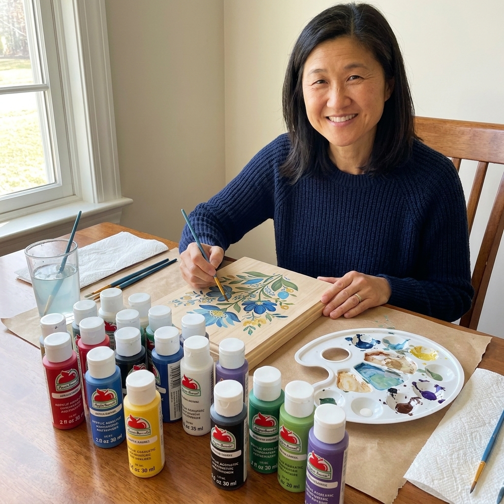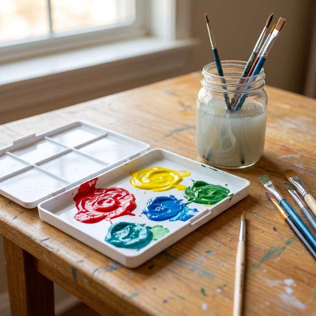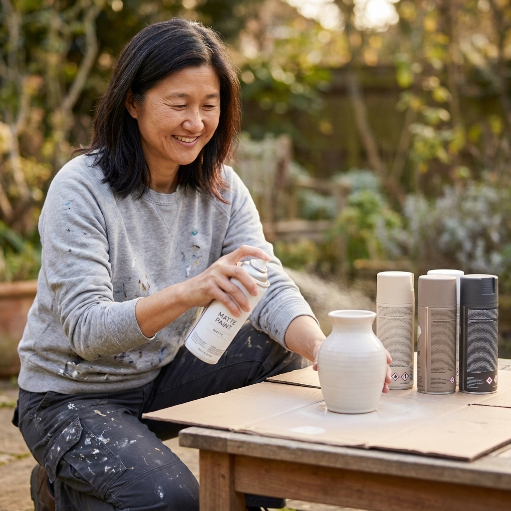
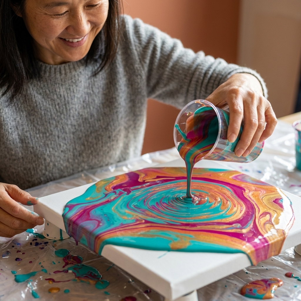
A beginner-friendly guide to acrylic pouring: how to mix paint and medium, plan colors, estimate paint amounts, and create beautiful dirty pours with trouble...
There’s a special kind of crafting heartbreak that happens when you bring home three “perfect” skeins of yarn or a stack of cute fat quarters… and then you put them together and something feels weirdly loud, muddy, or just off.
Good news: you don’t need an art degree to fix that. You just need a handful of color theory basics and a repeatable way to choose palettes. I taught elementary art for years, and my favorite color lessons were always the ones that made kids gasp and say, “Wait, that actually works.” This is that kind of lesson, but for grown-up makers (with slightly better impulse control and slightly bigger fabric stashes).
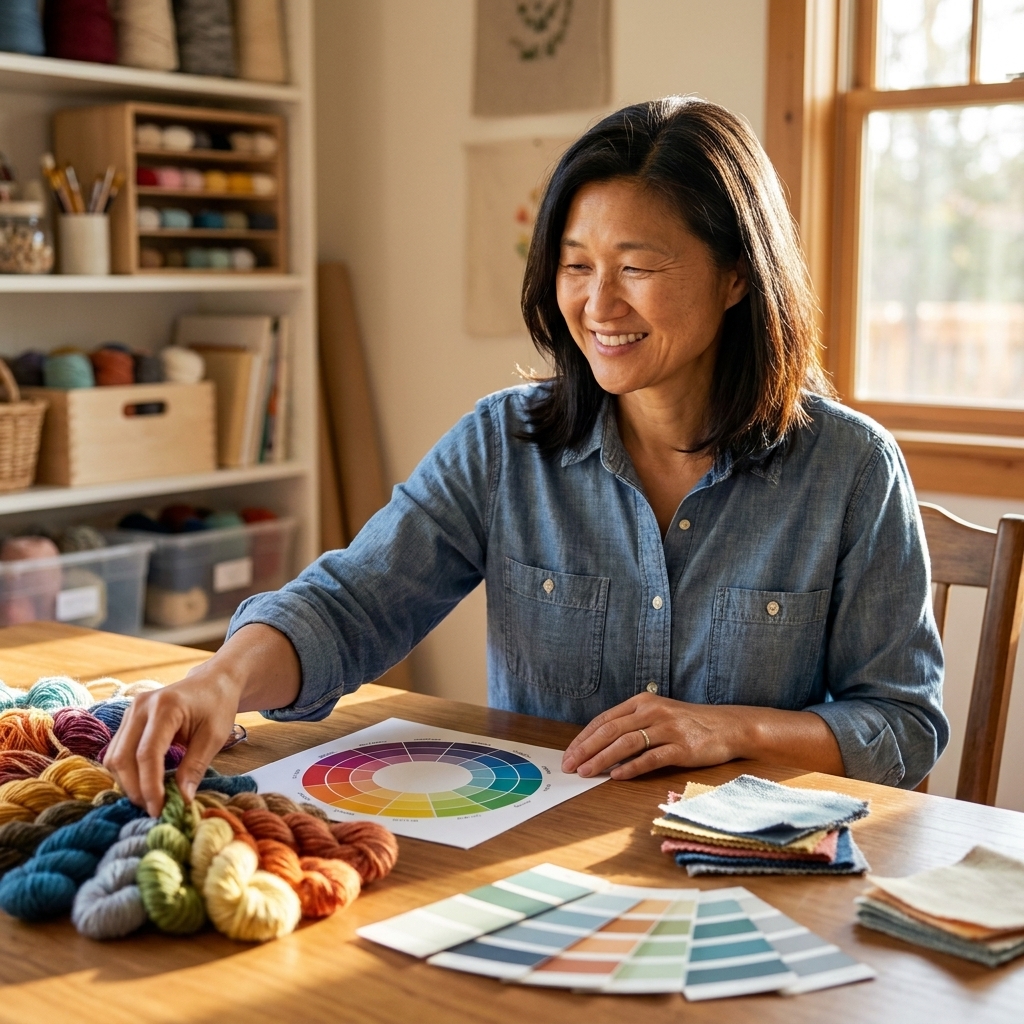
The three parts of color that matter
Cohesion usually comes down to three things working together. If you learn to spot them, choosing colors gets a whole lot easier.
Hue: the color family
Hue is the “name” of the color: red, orange, yellow, green, blue, purple. When you’re using a color wheel, you’re mostly working with hue relationships.
Value: how light or dark it is
Value is the quiet workhorse that makes palettes feel intentional. Two different hues can look harmonious if their values are similar, and two similar hues can clash if their values are fighting.
Quick crafter test: Take a photo of your fabrics or yarns, then turn the photo to black and white. If everything turns into the same mid-gray blob, you probably need more value contrast. If one piece turns nearly black while the others are pale, that piece may dominate unless you balance it.
Accessibility note: Value contrast also helps if you or someone you’re making for has color-vision differences. Don’t rely on red vs. green alone to create contrast. Make sure there’s a light/dark difference, too.
Saturation: how bright or muted it is
Saturation is intensity. Neon craft foam is high saturation. Dusty rose linen is low saturation. A common “why does this look wrong?” moment happens when you mix one super-saturated color with a bunch of muted ones.
Rule of thumb: If you want a calm, modern look, keep saturation levels similar. If you want a fun pop, let one color be the saturated star and have the rest support it.
How to use the color wheel
A standard color wheel shows hues arranged in a circle so you can see relationships at a glance. The relationships below are the ones you’ll actually use in real projects.
Complementary: opposites (high contrast)
Complements sit across from each other, like blue and orange, or red and green. They’re energetic and bold. In crafts, complementary palettes can look amazing, but they can also feel “sports team” if you use both at full strength.
- Make it softer: Use one color as the main and the complement as an accent.
- Make it richer: Choose muted versions (navy with terracotta, forest with cranberry).
Analogous: neighbors (easy and cohesive)
Analogous colors sit next to each other on the wheel, like blue, blue-green, and green. This is my go-to for quilts, crochet blankets, and any project where I want harmony without a lot of planning.
- Tip: Include one “bridge” color between your two favorites. It’s like adding a transition note in music.
Triadic: three-way balance (playful)
Triadic palettes use three hues that form a triangle on the wheel, like red, yellow, and blue, or orange, green, and purple. This is a great structure for kid projects, statement knits, or cheerful home decor.
- Tip: Pick one dominant color, one secondary, and one accent. Equal amounts of all three can get chaotic fast.
Split complementary: bold, easier to control
Instead of using a direct complement, you use the two neighbors of the complement. Example: if your main is blue, you’d pair it with yellow-orange and red-orange. You get contrast without that “two colors shouting” effect.
If you like color, but you also like calm, split complementary is your best friend.
Warm vs. cool, simplified
Warm colors (reds, oranges, yellows) feel sunny and cozy. Cool colors (greens, blues, purples) feel airy and calm. Cohesive palettes often have a temperature plan, even if you didn’t realize you were making one.
Two easy temperature plans
- Mostly warm, with one cool accent: Terracotta + mustard + cream, with a tiny bit of teal.
- Mostly cool, with one warm accent: Navy + sage + gray, with a pop of coral.
Also important: In real-world materials, most shades of a hue lean warm or cool (it’s all in the undertone). There are warm blues (leaning teal) and cool blues (leaning violet). If your project feels “off,” check whether your blues or reds are fighting each other on temperature.
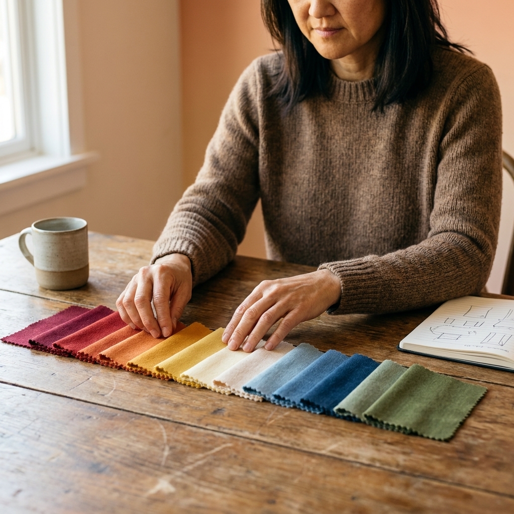
My go-to formula: 60-30-10
If you’ve ever stared at a pile of supplies wondering, “How much of each color do I use?” this is for you.
60-30-10 isn’t a law of the universe, it’s a handy guideline. Scale it up or down depending on the project, how busy your prints are, and how bold you want the result to feel.
- 60% main color: The background, the sweater body, the quilt base, the wall color.
- 30% supporting color: Secondary fabric, stripes, cuffs, borders.
- 10% accent color: A small punch that makes everything look designed.
This works beautifully for yarn projects where one skein is doing the heavy lifting, for quilt layouts where a neutral anchors the chaos, and for painted furniture where hardware or details carry the accent.
What counts as a neutral?
Neutrals aren’t only black, white, and beige. In fabric and yarn, you can treat these as neutrals too: denim blue, olive, charcoal, chocolate brown, and many low-saturation dusty tones.
Palette recipes to steal
These are grab-and-go structures that work for yarn, paint, paper, and fabric. Swap the exact shades to match your vibe.
1) Modern calm (analogous + neutral)
- Main: sage
- Support: blue-green
- Accent: deep forest or navy
- Neutral: warm cream or light gray
Great for: Baby blankets, minimalist quilts, watercolor cards, cozy home decor.
2) Cozy vintage (muted complementary)
- Main: dusty rose
- Support: warm taupe
- Accent: muted olive
- Optional pop: aged gold
Great for: Embroidery hoops, cottagecore accessories, thrifted furniture makeovers.
3) Bright and happy (triadic, controlled)
- Main: teal
- Support: sunny yellow
- Accent: coral
- Neutral: white or pale sand
Great for: Kids’ rooms, party decor, scrappy quilts, playful crochet.
4) High contrast, not harsh (split complementary)
- Main: deep blue
- Support: soft peach
- Accent: mustard
- Neutral: warm gray
Great for: Statement knits, painted accent walls, modern patchwork.
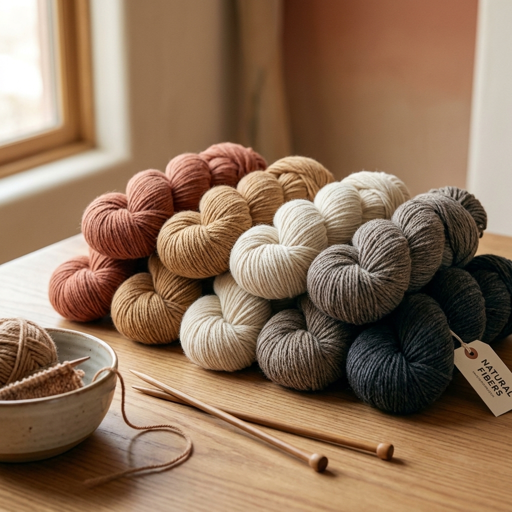
Choosing colors by craft
Yarn and knitting or crochet
- Watch value more than hue: In textured stitches, similar values can blur your pattern.
- Variegated yarn is already a palette: Pull your supporting colors from the yarn itself. Choose solids that match one or two shades inside the variegation.
- Limit the stars: If one yarn is speckled or wildly variegated, keep the rest simple and lower saturation.
Fabric and quilting
- Prints need breathing room: Add solids or low-volume prints so your eye can rest.
- Vary print scale: A mix of small, medium, and large prints usually looks more intentional than all one scale.
- Use a “unifier”: Pick one color that appears in every fabric, even if it’s tiny.
- Mind undertones in whites: Mixing a blue-white with a cream-white can look accidental. Choose one white temperature and stick with it.
Paint and home DIY
- Consider lighting: Warm bulbs push colors warmer; daylight can make some colors look cooler and sharper.
- Pick your fixed elements first: Countertops, floors, and rugs are your non-negotiables. Build your palette around them.
- Sheen changes perception: A glossy paint reflects more light, which can make a color look brighter than the same shade in matte.
Quick fixes when it feels off
This is the part where I save you from ripping out half a project (ask me how I know).
If it looks too busy
- Add a neutral or a solid to give the eye a break.
- Reduce the number of high-saturation colors to one.
- Repeat the same color in two places so it feels intentional.
If it looks muddy
- Increase value contrast. Add something lighter or darker.
- Check if you’ve mixed too many muted mid-tones together.
- If you’re painting, let layers dry fully. Wet paint can look darker and duller.
If it looks too harsh
- Swap one bright for a toned-down version (think “dusty” or “smoky”).
- Add a soft neutral between high-contrast colors, like cream piping between navy and orange.
- Use the accent color in smaller doses.
If one color is screaming
- Make it the accent and reduce its quantity.
- Pair it with a color of similar value so it blends more.
- Add a neutral buffer around it (borders, background, negative space).
A simple palette routine
Start with one “heart” color. The one you love and can’t stop thinking about.
Pick your vibe: Calm (analogous), bold (complementary), playful (triadic), bold but controlled (split complementary).
Choose a main, support, and accent. Use 60-30-10 as a starting point.
Check value in black and white. Make sure you’ve got contrast where you want it.
Check saturation. Are you mixing one neon with a bunch of dusty tones? Either mute the neon or let it be the one pop.
Add a neutral. Even colorful projects benefit from a resting place.
If you do just those six steps, you’ll start getting that “Wow, that looks so pulled together” result without the stress.
Test color without wasting supplies
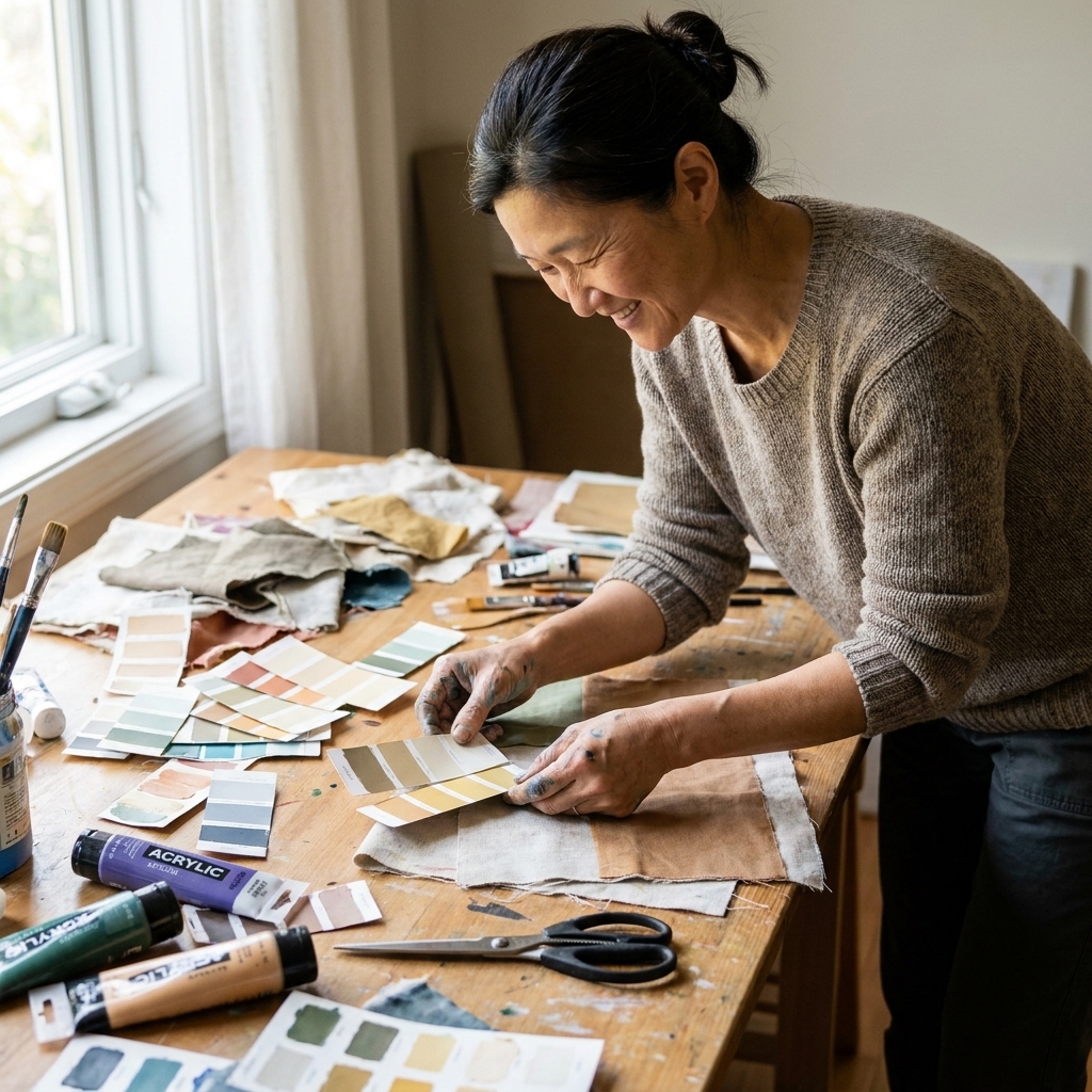
I’m a big fan of testing colors without buying extra stuff, especially if you’re working on a budget or trying to use what you’ve got.
- Scrap mockups: Stitch or glue tiny scraps into a mini block or mini collage.
- Paint swatches on packaging: Cereal box cardboard is fantastic for quick paint tests.
- Photo audition: Take a picture of your materials, then use your phone’s markup tool to cover small areas with a neutral and see if the palette calms down.
- Borrow from nature: Pine needles plus berries plus bark is already a palette. So is beach sand plus sea glass plus driftwood.
FAQ
How many colors should I use?
For most beginner-friendly projects, three colors plus a neutral is the sweet spot. If you want more, keep them in the same saturation family (all muted or all bright) and repeat each color at least twice so it feels intentional.
What’s the easiest palette for beginners?
Analogous plus a neutral. Pick one color you love, then choose its two neighbors on the color wheel, and add cream, gray, or denim as your grounding neutral.
Why do my colors look good online but weird at home?
Lighting and screens. Your room’s bulbs can shift temperature, and screens vary wildly. If it matters, look at your materials in the same light where the finished project will live, and check value by snapping a quick black-and-white photo.
How do I match a new fabric or yarn to what I already have?
Match two things, not one: match the hue family (blue-ish, green-ish) and the saturation (bright vs. dusty). If you can also match temperature (warm vs. cool), it’ll look like you planned it from the beginning.
Final pep talk
Color theory isn’t about rules that trap you. It’s about tools that give you options. If you love a “weird” combo, there’s almost always a way to make it work by adjusting value, saturation, or the amount of each color you use.
And if you ever end up with a palette that goes sideways, welcome to the club. That’s not failure. That’s just crafting. Keep the scraps, learn the lesson, and try again with a little more confidence.